A biweekly newsletter with public space news, resources, and opportunities.
A curated dispatch on all things public markets plus the latest announcements from the Market Cities Program.
William H. Whyte once said, "It is difficult to design a space that will not attract people - what is remarkable is how often this has been accomplished." Today, many public spaces seem to be intentionally designed to be looked at but not touched. They are neat, clean, and empty - as if to say, "no people, no problem!" But to us, when a public space is empty, vandalized, or used chiefly by undesirables, this is generally an indication that something is very wrong with its design, or its management, or both.
The following pairs of photographs illustrate some of the most common problems of public spaces.
Lack of places to sit - Many public spaces don't even provide a place to sit. So, in their protracted quest just to be comfortable, people are often forced to adapt to the situation in their own way. Sometimes they simply give up (below), or have to sit on briefcases (second image below).
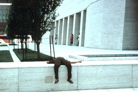

A lack of good places to sit is an equally important issue. For example, a choice of seats in sun or shade can make all the difference in a place's success, depending on its climate and location. Allowing people to sit near a playground or within view of other activities is also crucial.
Lack of gathering points - This includes features people want or need, such as playgrounds, or places where varying elements--bus stop, vending cart, outdoor seating--combine to create a gathering point. Food is often a critical component of a successful gathering point.
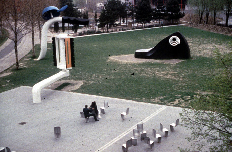
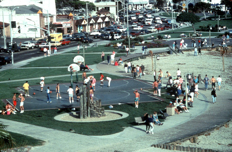
Paris' Parc de la Villette (top) has seats that force people to sit in unsociable ways, and signs that ask them not to climb on the sculpture. Though located along a stretch of the Pacific Coast Highway, this park at Laguna Beach (near top) has loads of activities, food, and places to sit. It is a busy, healthy gathering place.
Poor entrances and visually inaccessible spaces - If a space is to be used, people need to see it and they need to be able to get to it.
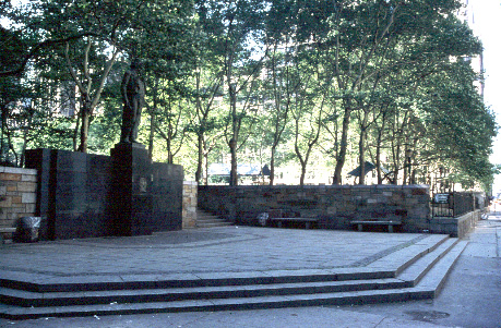

A dark or narrow entrance such as those that used to be at New York City's Bryant Park (top) keeps people out instead of inviting them in. The same entrance (near top), redesigned to be more inviting and open, has kiosks that sell coffee and sandwiches, and the interior of the park is visible from the street.
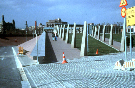
Dysfunctional features Oftentimes features are designed simply to punctuate the space, serving a use more visual than functional, instead of encouraging activity to occur around them - as at this waterfront park in Barcelona, below.
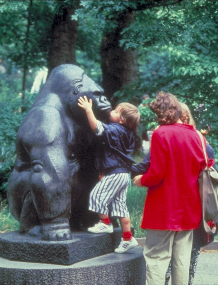
Good features, such as the friendly gorilla at the Berlin Zoo (above), encourage activity to occur around them.
Paths that don't go where people want to go
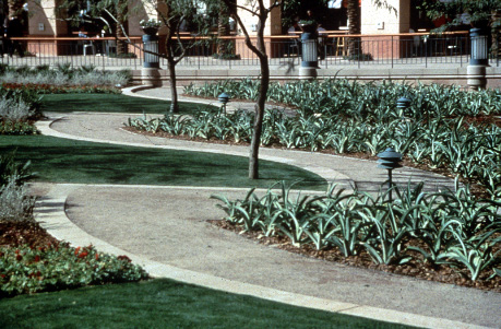
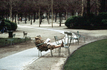
Paths that lead to nowhere are useless, as demonstrated at this Phoenix, Arizona park (top). The Luxembourg Gardens in Paris, however (near top), show the art of making a path that pulls people along it, or allows them to stop and relax.
Domination of a space by vehicles There may be a lack of crosswalks, or streets that are too wide, or lacking sidewalks.
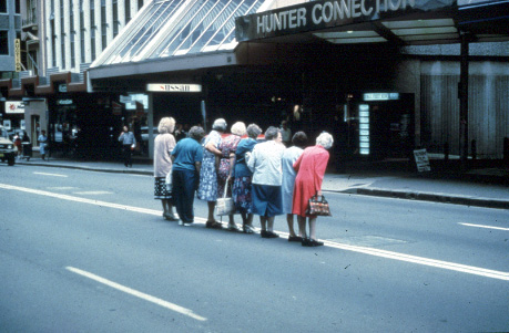

A main street is not a highway. One should not fear crossing the street so much that the activity needs to occur in groups, as on George Street in Sydney, Australia (top). Crossing the street should be an easy, comfortable activity. Even if you have to wait (near top, Paris, France)
Blank walls or dead zones around the edges of a place The area around a space is as important to its success as the design and management of the space itself.
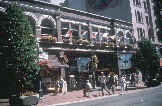
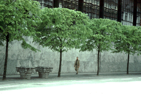
The blank wall (near top) contributes nothing to the activity of the street. In fact, it doesn't even seem real.
Inconveniently located transit stops Bus or train stops located in places where no one wants to use them are a good recipe for failure.
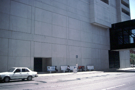

A transit stop located in a busy, active place can not only make that place better, but also increase transit use.
The rich text element allows you to create and format headings, paragraphs, blockquotes, images, and video all in one place instead of having to add and format them individually. Just double-click and easily create content.
The rich text element allows you to create and format headings, paragraphs, blockquotes, images, and video all in one place instead of having to add and format them individually. Just double-click and easily create content.
Body Text Body Link
The rich text element allows you to create and format headings, paragraphs, blockquotes, images, and video all in one place instead of having to add and format them individually. Just double-click and easily create content.
Here is some highlighted text from the article.


Headings, paragraphs, blockquotes, figures, images, and figure captions can all be styled after a class is added to the rich text element using the "When inside of" nested selector system.
Headings, paragraphs, blockquotes, figures, images, and figure captions can all be styled after a class is added to the rich text element using the "When inside of" nested selector system.
Headings, paragraphs, blockquotes, figures, images, and figure captions can all be styled after a class is added to the rich text element using the "When inside of" nested selector system.