A biweekly newsletter with public space news, resources, and opportunities.
A curated dispatch on all things public markets plus the latest announcements from the Market Cities Program.

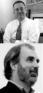
We recently chatted with experts John Massengale and Victor Dover about their book Street Design, which details the art and practice of creating great streets for people. In researching this book, John and Victor traveled across the world evaluating and experiencing different kinds of streets. John is an architect, urbanist, owner of Massengale & Co LLC, and Board Member at the Congress for New Urbanism. Victor Dover is a Fellow of the American Institute of Certified Planners, Principal in the firm Dover, Kohl & Partners Town Planning, and a Board Member and National Chair of the Congress for New Urbanism.
Tell us a little bit about Street Design: what you learned in conducting your research, and what you feel is most important for people to know about complete streets.
John: The book is about the urban practice of making great streets and has a lot of examples of old streets, new streets and redone streets, where we share a lot of the sensibility of PPS in Placemaking.
Victor: We started the project thinking we needed to create the book we’ve always needed but haven’t necessarily had. There are technical manuals, which are written for engineers, and every year there is a little more literature that supports the idea of Placemaking through design, and on the other hand there are books written for urban designers (history etc.) but there’s been a gap in the middle between those two. We wanted to create more of a ‘how to/lessons learned’ kind of book.
It was provoked by noticing that all over the country, there’s a lot of effort being expended on making more streets work for more people, for instance with the Complete Streets movement. Although a lot of time and money was being put into large projects, they weren’t necessarily leaving behind streets that are better to grow a business on, or to make a home. These are the efforts that create a great address -- places people want to live, work, or be over another place. We thought, ‘Why is that?’ It’s the Placemaking piece, actually. It turns out that adding a stripe to a street may be a good start, but it is not the end. We started rethinking our whole experience with streets…taking a lot of pictures and measuring things, asking ourselves, ‘Why are we drawn to some places, and not to others?’
John: We got a grant and did some traveling. We found that even some of our favorite streets in Europe have become overwhelmed by cars. One of our emphases has definitely been in making a balance for the street. Different experts focus on their specialties, and do not focus on making a complete street the way Placemakers want it. How to pull all of these disciplines together to create a place where people want to be was a major goal of our research. We returned to streets in Europe that we remembered as our favorite streets, and that show up in urban design books as models. Yet as Europe has gotten more prosperous, it also has gotten more and more auto-dependent, and cars have overwhelmed their streets. It’s easier to see in Europe than America because we lived through the transition here. You really notice it when you visit a street you haven’t seen in 20 years.

What are some of the efforts taking place to correct that?
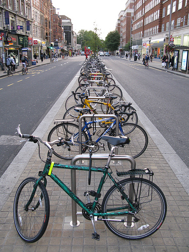
Victor: Kensington High Street is a great example of the kind of street we had in mind when writing the book. Over the years, well-intentioned officials and engineering teams had added more and more elements to the street. They added lanes, and then barricades and wrought iron railings along the curbs to channel pedestrians to infrequent crosswalks where they had to cross in a zigzag pattern through corrals in order to just get across the street, because it had been so dominated by traffic. In the process, they also added a lot of signs, pavement markings, and lights…the whole toolkit. Then they went back and rethought the street. They started from the pedestrian point of view and simplified the street by reducing the amount of signage and barricades. Now cars, pedestrians, and a ton of cyclists happily coexist in this space together. It’s really an astonishing change.
John: Instead of saying, ‘We’re going to make the bike lane bigger, or the pedestrian crossing better,’ they looked at the entire street and said, ‘for the purpose of the street, we’re going to make the color palette very limited, the material palette very limited.’ It’s frequently the opposite of what you see in complete streets in the U.S., where particular elements are emphasized.
We can’t make a complete street everywhere, so how transferrable is Kensington High Street to other places?
John: Just painting narrower lanes doesn’t make a good street—it makes a less bad street. On Kensington High Street, they thought about how to make a better street. Yes, they have crosswalks, but for example, instead of a bump out, they have medians where service cars and bikes park; it’s a more comprehensive look at the street.
Victor: A lot of places that have been designed specifically around short, high-traffic periods of the day result in their being over-designed for the rest of the day. Look at peak hour demand in a smarter way: no amount of road widening or crosswalk removal is ever going to make congestion go away. Let’s get on with the business of making a great neighborhood, and making places, where we can accommodate all modes.
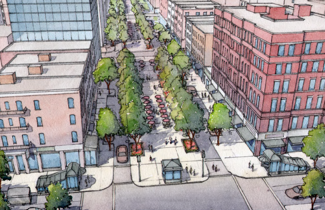
John: In New Urbanism, we might say that design is a way of solving problems. It’s not a matter of ‘bike lane or no bike lane;’ good design is good Placemaking. Here in NYC you see, on the one hand, terrific places where the Department of Transportation (DOT) has taken lanes away from cars to encourage more people to bike or walk. At the same time, the DOT’s design for 2nd Avenue after the subway is a one-way road: wide lanes, parking on one side, with an express bus lane coming down beside the sidewalk, and restaurant tables on the other side…this is not good Placemaking. In a competition last year we designed sort of a Barcelona Las Ramblas for 2nd Avenue saying, ‘Let’s not just try to cut auto use; we’re in NYC, where 80% of people are not car users, so let’s design for the 80%, not the 20%.’

What are some of the most important lessons from your research you’d like to share with New Urbanists regarding biking and walking?
John: Let’s design streets as places where people want to get out of their cars walk and ride their bikes. The key for me is to include the walkers; let’s not focus too much on just bike lanes, let’s focus on the entire street.
Victor: Keep it simple. Keeping it simple seems to really help. We saw places that were spatially simple, legible, well proportioned, and comfortable. We saw lots of places where there was red, green, and yellow paint, and then we came to places where there was a simple palette. A range of grays often provides less visual noise. The treatment of the landscape, where in some places 60% of urban design is street trees, was evident in many places.
The streets that gave off the best impressions often the ones that had a simple line of the same tree species down the side or center. The most comfortable streets were the narrower streets: small blocks, small streets, grids and webs. A richer network makes for better individual streets, because traffic is dispersed and no one street has to be designed to carry the whole load. That’s not to say that we can’t have wonderful big streets, but whenever possible a narrow street seems to be a positive solution.
John: A variety of streets are important. If you go to downtown Manhattan, where you have the beautiful narrow streets then you come out on Broad Street with buildings large enough to make it a space, that adds a lot of richness. If you take the Manhattan grid and you remove Park Avenue and the squares and parks and things like that, it becomes a very boring place. Large, small, narrow, wide: the variety is important.
What do you think experts from varying fields can gain from attending the Pro Walk / Pro Bike: Pro Place conference, and what should we be telling them?
John: We should be making better streets, not better bike lanes or pedestrian crossings. Great streets never come out of creating separate tubes for each user or from streetscape. There are great streets where even sidewalks and plazas are asphalt; place matters most. When you are hired to fix a street, you feel obligated to do cool stuff.
Victor: Making great addresses beats installing ugly white nothing space. In the end, what we want people to say is, ‘That location means something to me. I’ll support it, and invest in it.’
--------------------------
Pro Walk/Pro Bike®: Pro Place is North America’s premier walking and bicycling conference, which occurs biannually. The next conference will occur September 8-11th, 2014 in Pittsburgh, PA. Join more than 1,000 planners, engineers, elected officials, health professionals, and advocates to gain the insights of national experts in the field, learn about practical solutions to getting bike and pedestrian infrastructure built, and meet peers from across the country.
The rich text element allows you to create and format headings, paragraphs, blockquotes, images, and video all in one place instead of having to add and format them individually. Just double-click and easily create content.
The rich text element allows you to create and format headings, paragraphs, blockquotes, images, and video all in one place instead of having to add and format them individually. Just double-click and easily create content.
Body Text Body Link
The rich text element allows you to create and format headings, paragraphs, blockquotes, images, and video all in one place instead of having to add and format them individually. Just double-click and easily create content.
Here is some highlighted text from the article.


Headings, paragraphs, blockquotes, figures, images, and figure captions can all be styled after a class is added to the rich text element using the "When inside of" nested selector system.
Headings, paragraphs, blockquotes, figures, images, and figure captions can all be styled after a class is added to the rich text element using the "When inside of" nested selector system.
Headings, paragraphs, blockquotes, figures, images, and figure captions can all be styled after a class is added to the rich text element using the "When inside of" nested selector system.

We are committed to access to quality content that advances the placemaking cause—and your support makes that possible. If this article informed, inspired, or helped you, please consider making a quick donation. Every contribution helps!
Project for Public Spaces is a 501(c)(3) tax-exempt organization and your donation is tax-deductible within the guidelines of U.S. law.