A biweekly newsletter with public space news, resources, and opportunities.
A curated dispatch on all things public markets plus the latest announcements from the Market Cities Program.

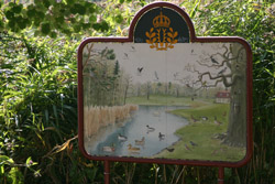
A good signage system can perform multiple functions. On the most basic level, it provides effective information and direction for people to find their way around a downtown, a building complex, park, or other public space. It can also encourage learning experiences; create and maintain an image for a place; communicate rules; and provide a sense of place and local pride by incorporating history or cultural details.
Signs can meet specific needs and target certain areas. But their location is key. Placing signage in conjunction with other amenities such as benches, cafes, restrooms, and phones, or places where paths cross, can create mini-"destinations" or places-within-a-place. Elements that are "triangulated" in this way have a bigger impact together than they would separately, and allow users to attend to several needs at the same place. When they are well-located, signs can help to create a comfortable and social place where people can relax and spend time.
Below is a step-by-step guide to help non-professionals participate in the process of developing and designing a signage system, as well as information on the range of signage types.
Decide on the aims and purposes for the signage system you want to develop. Determine what functions the signage is to serve, whom it is to serve, and the kinds of information you want to communicate.
Build upon what already exists by using what works well and improving on that which does not. Using existing elements or variations upon those elements can build users' familiarity with signs and their meanings. A survey of the existing signage may include:
Consider and identify any unique aspects of the history or culture in and around the site that might contribute to a sense of place, nurture local pride and stimulate learning about the place. This could include historical events, elements of architectural interest, or natural features.
Assemble the information you have gathered and organize it both in writing and in a plan. Include information on signage goals, audiences, and tone of the information to be conveyed.
Once you have completed the above steps, you will have a wealth of information that can be developed into a master plan, and will be of great help in working with a graphic designer or signage consultant.
A master plan should include signs for information (both regulatory and interpretive), wayfinding and orientation, and identification purposes. It should also lay out the types of signage that are needed, along with text and symbols. Using the guidelines and the written issues you have developed, organize and prioritize information requirements into groups of signage by type. Develop text and symbols for new signs and revise messages for existing signs as necessary.
Do brief tests of the signage you have developed by talking to users about their experiences with the signage, as well as how the messages are phrased, designed, and located. Evaluate the effectiveness of the signs according to the goals, purposes, and guidelines that you developed. Depending on the responses you get from users, experiment with how messages are phased, how signs are designed, and where they are located.
The rich text element allows you to create and format headings, paragraphs, blockquotes, images, and video all in one place instead of having to add and format them individually. Just double-click and easily create content.
The rich text element allows you to create and format headings, paragraphs, blockquotes, images, and video all in one place instead of having to add and format them individually. Just double-click and easily create content.
Body Text Body Link
The rich text element allows you to create and format headings, paragraphs, blockquotes, images, and video all in one place instead of having to add and format them individually. Just double-click and easily create content.
Here is some highlighted text from the article.


Headings, paragraphs, blockquotes, figures, images, and figure captions can all be styled after a class is added to the rich text element using the "When inside of" nested selector system.
Headings, paragraphs, blockquotes, figures, images, and figure captions can all be styled after a class is added to the rich text element using the "When inside of" nested selector system.
Headings, paragraphs, blockquotes, figures, images, and figure captions can all be styled after a class is added to the rich text element using the "When inside of" nested selector system.

We are committed to access to quality content that advances the placemaking cause—and your support makes that possible. If this article informed, inspired, or helped you, please consider making a quick donation. Every contribution helps!
Project for Public Spaces is a 501(c)(3) tax-exempt organization and your donation is tax-deductible within the guidelines of U.S. law.