A biweekly newsletter with public space news, resources, and opportunities.
A curated dispatch on all things public markets plus the latest announcements from the Market Cities Program.

The following is adapted from William H. Whyte's City: Rediscovering the Center (Anchor Books, 1989). Here, Whyte recounts some of the findings that went into his design recommendations to improve New York City's "bonus plazas." The recommendations were part of a 1975 amendment to the 1961 zoning resolution that offered developers an increase in building bulk in exchange for providing plazas, arcades, atriums, and other public space. Whyte's Street Life Project conducted months of research observing people in and around these public spaces and found that, despite some successes like the Seagram Building plaza (mentioned below), most spaces were woefully inadequate.
It takes real work to create a lousy place. In addition to spikes and metal objects, there are steps to be made steep, additional surveillance cameras to be mounted, walls to be raised high. Just not doing such things can produce a lot of sitting space.
It won't be the most comfortable kind but it will have the great advantage of enlarging choice. The more sittable the inherent features are made, the more freedom people have to sit up front, in the back, to the side, in the sun, or out of it. This means designing ledges and parapets and other flat surfaces so they can do double duty as seating, tables, and shelves. Since most building sites have some slope to them, there are opportunities for such features, and it is no more trouble to leave them sittable than not.

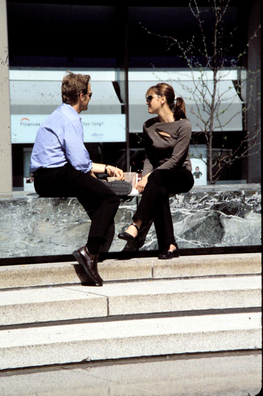
This is one of the lessons of Seagram. Philip Johnson recounts that when Ludwig Mies van der Rohe saw people sitting on the ledges, he was quite surprised. He had never dreamt they would. But the architects had valued simplicity. So there were no fussy railings, no shrubbery, no gratuitous changes in elevation, no ornamentation to clutter the spaces. The steps were made easy and inviting. Though there was not a bench on the place, it proved eminently sittable. The periphery includes some six hundred feet of ledge and step space and it is just right for sitting, eating, and sunbathing.
Ledges, then, should be sittable. But how should this be defined?

Sitting Heights
One guideline we thought would be easy to establish was for sitting heights. It seemed obvious enough that somewhere around 16 to 17 inches would probably be the optimum. But how much higher or lower could a surface be and still be sittable? Thanks to slopes, several of the most popular ledges provided a range of continuously variable heights. The front ledge at Seagram, for example, started at seven inches at one corner and rose to 44 inches at the other. Here was an opportunity for a definitive study, we thought; by recording over time how many people sat at what heights, we would get a statistical measure of preferences.
The human backside is a truly important dimension - one that many architects ignore. Not often will you find a ledge or bench that is deep enough to be sittable on both sides. Some aren't sittable on one.
We didn't. At any given time there would be clusters of people at one height, fewer on another. But such correlations did not last very long. When we cumulated many days of observations, we found that people had been distributing themselves with remarkable evenness over the whole range of heights. We had to conclude that people will sit almost anywhere between a height of one foot and three, and this was the range that was to be specified in the zoning. People will sit lower or higher, of course, but there are apt to be special conditions - a wall too high for most adults to mount but just right for teenagers.
A dimension that is truly important is the human backside. It is a dimension many architects ignore. Rarely will you find a ledge or bench that is deep enough to be sittable on both sides. Some aren't deep enough to be sittable on one. Most frustrating are the ledges just deep enough to tempt people to sit on both sides, but too shallow to let them do so comfortably. At peak times people may sit on both sides but they won't be comfortable doing it. They will be sitting on the forward edge, awkwardly.
Thus to another of our startling findings: ledges and spaces two backsides deep seat more people than those that are not as deep Our recommended depth was arrived at quite pragmatically. The minimum-depth ledge we came across that was consistently used on both sides was 30 inches deep. If a ledge is at least that deep and is accessible on both sides, the length of each side counts as seating.
The minimum-depth ledge we came across that was consistently used on both sides was 30 inches deep.
For a few additional inches of depth, then, a developer can double the amount of his ledge-sitting space. This does not mean that double the number of people will use the ledge. They probably won't. But that is not the point. The benefit of the additional space is social comfort. There will be more room for groups and individuals to sort themselves out, more choice, and more perception of choice.
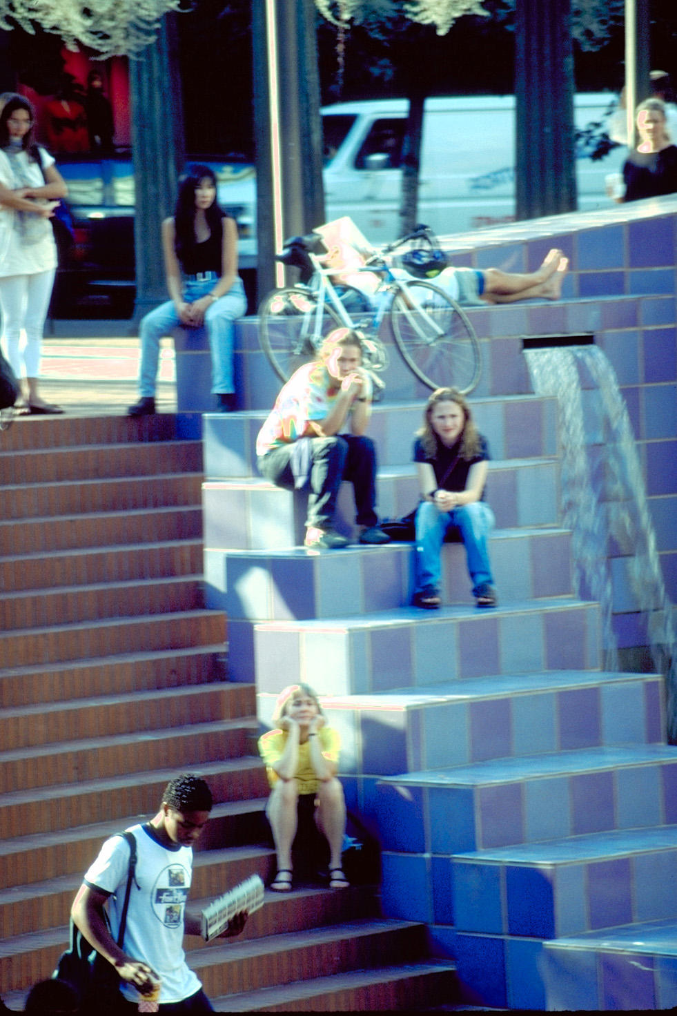
Steps work for the same reason. They afford an infinity of possible groupings, and the excellent sight lines make all the seating great for watching the theatre of the street. Steps are not very comfortable- they are cold, there is no real back support, and there is often not enough depth for comfort. With no sacrifice of their stair function, however, they could be made more comfortable. Landscape architect Paul Friedberg specifies a tread depth of at least fourteen inches for his steps; since this marries well with a low riser of, say, six or six and a half inches, the steps are also very easy going up and down on.

We decided not to credit steps as required sitting space. If they were, developers could have too easy an out, and some plazas would be mostly steps and little else. But steps should be planned with people's sitting tendencies in mind. This is especially the case with corners of steps.
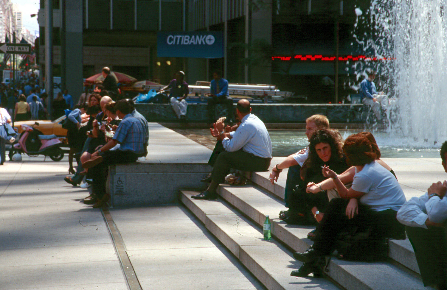
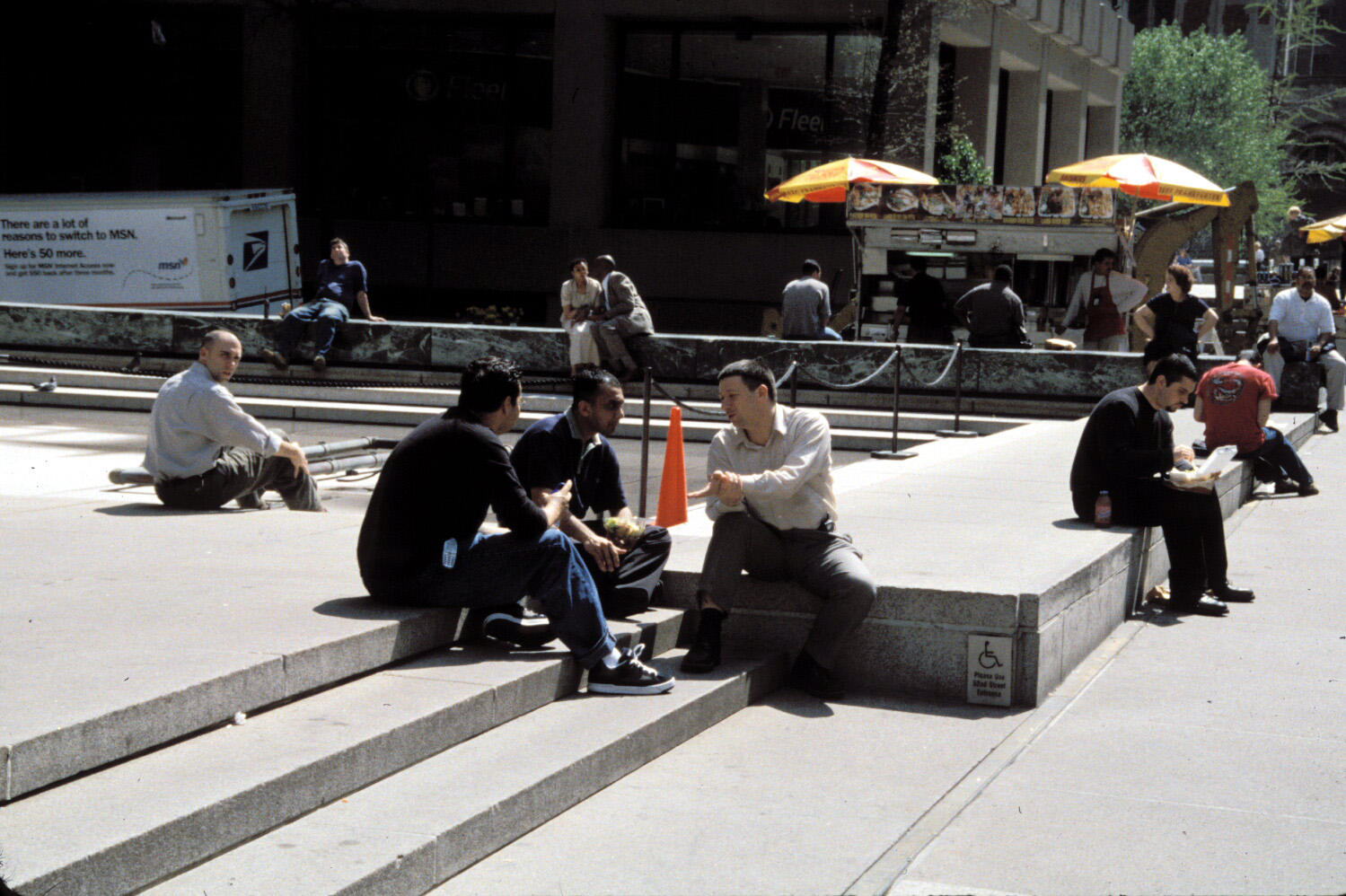
To understand why, let us look again at the social life of plazas. The majority of the people who use plazas are in pairs or groups of three or more. Most sitting is linear. This is fine for individuals all right for pairs, but not very good for three or more. Left to arrange things for themselves, as with chairs, people in groups will position themselves at angles somewhere around forty-five degrees This is the most comfortable for talking, and the most comfortable for brown bag lunching.

Without knowing it, architects design for such groupings when they have step corners, and especially so with a ledge abutting at a right angle. Groups are attracted to these places. And so, not so paradoxically, are pedestrians on the move. Seagram is a classic example. People who are entering and leaving the building by the main Park Avenue doorways walk on the diagonal between the doorways and the step comers. In the process they bisect what are often the busiest eating and sitting spaces on the steps. Conflict? Theoretically, yes Practically, no. For all the bustle, or because of it, the sitters don't seem to mind. Nor do the walkers. Sometimes tiptoeing, they will thread their way through the clumps of people rather than take lone detours around them.

We found similar patterns at other places. All things being equal you can calculate that where pedestrian flows bisect a sittable place that is where people will most likely sit. And it is not so perverse of them. It is by choice that they do. If there is some congestion, it is an amiable one.
Circulation and sitting, in sum, are not antithetical but complementary. I stress this because a good many planners think the two should be kept separate. More to the point, so do some zoning codes New York's called for "pedestrian circulation areas" separate from "activity areas" for sitting. People ignore such boundaries.
More public space amenities resources? Check out our furnishing your public spaceresource.
The rich text element allows you to create and format headings, paragraphs, blockquotes, images, and video all in one place instead of having to add and format them individually. Just double-click and easily create content.
The rich text element allows you to create and format headings, paragraphs, blockquotes, images, and video all in one place instead of having to add and format them individually. Just double-click and easily create content.
Body Text Body Link
The rich text element allows you to create and format headings, paragraphs, blockquotes, images, and video all in one place instead of having to add and format them individually. Just double-click and easily create content.
Here is some highlighted text from the article.


Headings, paragraphs, blockquotes, figures, images, and figure captions can all be styled after a class is added to the rich text element using the "When inside of" nested selector system.
Headings, paragraphs, blockquotes, figures, images, and figure captions can all be styled after a class is added to the rich text element using the "When inside of" nested selector system.
Headings, paragraphs, blockquotes, figures, images, and figure captions can all be styled after a class is added to the rich text element using the "When inside of" nested selector system.