A biweekly newsletter with public space news, resources, and opportunities.
A curated dispatch on all things public markets plus the latest announcements from the Market Cities Program.
Please note that these Hall of Shame nominations were written in a moment in time (most over a decade ago) and likely have since changed or even been transformed. If the above entry is now great, or still not so great, go ahead and comment below on how it has evolved or nominate it as a great place.

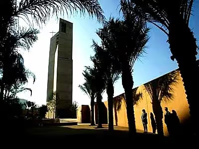
One wonders if it's possible to make it across the expanse of this cathedral's positively desert-like plaza without a bottle of water.

It seems churlish to criticize a building with a breathtakingly beautiful interior (not counting the really odd chandeliers) for its equally ugly exterior, but I'll do it anyway. The aggressively conceptual and minimalist courtyard of this massive cathedral, clearly designed to evoke the forecourts of Spanish colonial churches, seems like a desert. Its huge expanse of ochre-colored concrete, unmitigated by even one tree, with seating shoved into a corner by the gift shop, is brutal and forbidding. I wondered if I could make my way across it without a bottle of water, fearing only half in jest that I might die of thirst on my way to the front door.
Do not walk to the cathedral. I did, and I couldn't find the entrance. You are evidently expected to drive. It's L.A., so that's probably to be expected, but as an east-coast visitor, it seemed really weird to me.
Seating areas are limited. The courtyard is clearly expected to remain uncluttered by furniture, plants, or humans. Traverse it at your own risk. I half expected to see the bleached skeletons of unfortunate cattle scattered randomly across the baked, angry landscape, as one does along the highways of Utah and Nevada.
I attended a service on a Sunday, when the place was packed - with the exception of the blank areas of the concrete courtyard, which everyone seemed to avoid as much as possible. I do not know what happens here the rest of the week.
Everyone gravitated to the tables near the gift shop. You might meet a friend here and then proceed to church. But you would avoid the vast blank concrete courtyard at all costs. It's just plain scary.
There is a greatness to this building. From the freeway at night, the glowing alabaster panels behind the gigantic cross are a beacon. Up close, however, this church says, "Go Away." Which is a shame, as the interior is stunning, with the light streaming through the alabaster, the soft swale of the floor toward the altar, the baldacchino, and most of all the gorgeous tapestries, most especially the restrained, simple one at the baptismal font depicting the baptism of Jesus by John the Baptist.
To me at least, this huge space seems human-scaled, much like St. Peter's in Rome, which is huge without being overwhelming. Yet on the outside you wonder if maybe you're not on the set of some apocalyptic, 1970Ís sci-fi movie, scurrying across the desert-like courtyard in a vain attempt to outrun the evil extraterrestrials trying to vaporize you with lasers like targets in a video game. It looks great from the freeway, but why does this building have to be so angry at pedestrian level?
*Please note that these Hall of Shame nominations were written in a moment in time (most over a decade ago) and likely have since changed or even been transformed. If the above entry is now great, or still not so great, go ahead and comment below on how it has evolved or nominate it as a great place.