A biweekly newsletter with public space news, resources, and opportunities.
A curated dispatch on all things public markets plus the latest announcements from the Market Cities Program.
Please note that these Hall of Shame nominations were written in a moment in time (most over a decade ago) and likely have since changed or even been transformed. If the above entry is now great, or still not so great, go ahead and comment below on how it has evolved or nominate it as a great place.

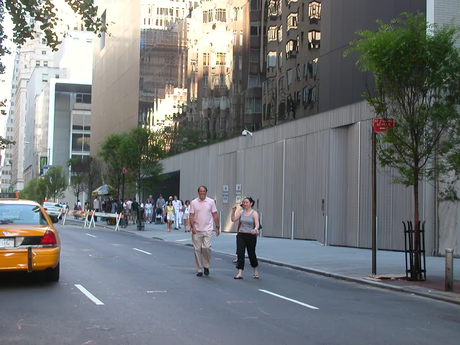
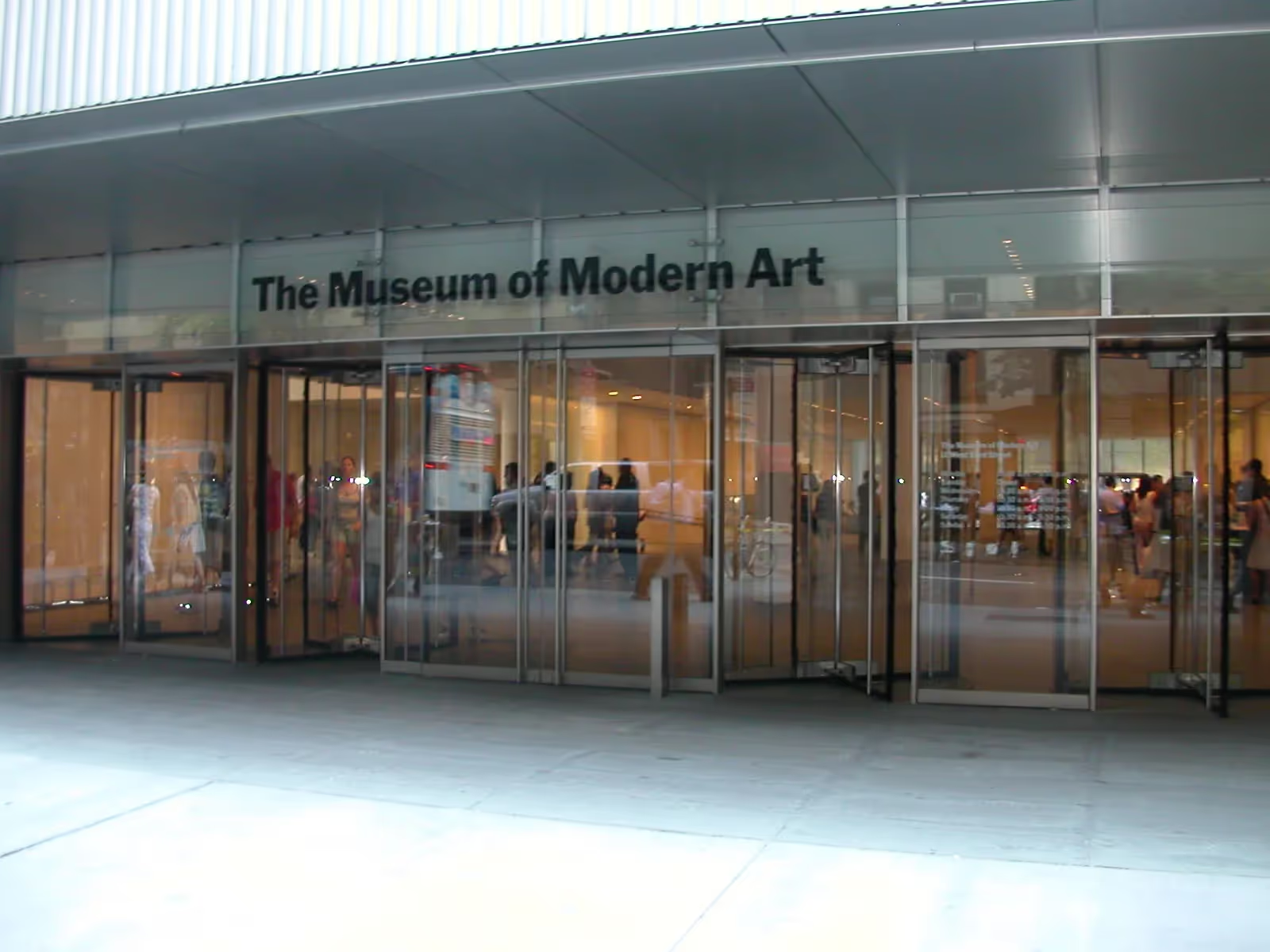
Despite a recent renovation of MoMA's interior spaces, the entrance and facade remain monotonous and impenetrable.

The recent renovation of MoMA's interior spaces, galleries and sculpture garden has been a triumph in terms of public space. That makes it all the more galling to see the entrance and facade remain so monotonous and impenetrable. The approach to the building feels more like the side of a junkyard or warehouse than a world-class cultural institution. At no point does the facade permit any transparency between the sidewalk and the interior. The entrance, meanwhile, has all the appeal of an open garage door. It evokes no sense of arrival, nor does it support any activity that could serve as a bridge between the Museum and the public realm.
William H. Whyte shrewdly captured the detrimental effects of blank walls when he wrote that they "proclaim the power of the institution, the inconsequence of the individual, whom they are clearly meant to put down, if not intimidate." MoMA surely does not want to project such an image. Its next renovation should focus squarely on how to create an exterior public space experience equal to its remarkable interior.

*Please note that these Hall of Shame nominations were written in a moment in time (most over a decade ago) and likely have since changed or even been transformed. If the above entry is now great, or still not so great, go ahead and comment below on how it has evolved or nominate it as a great place.