A biweekly newsletter with public space news, resources, and opportunities.
A curated dispatch on all things public markets plus the latest announcements from the Market Cities Program.
Please note that these Hall of Shame nominations were written in a moment in time (most over a decade ago) and likely have since changed or even been transformed. If the above entry is now great, or still not so great, go ahead and comment below on how it has evolved or nominate it as a great place.
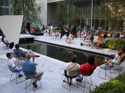
A 2004 re-design made this renowned New York institution an even better place to view art--and people.

The interior of MoMA succeeds because its spaces span a broad range of functions, from the galleries housing its exceptional collection to the ever-popular Abby Aldrich Rockefeller Sculpture Garden. On one end of the spectrum, art is the center of attention. On the other end, art is a backdrop to social activity. In between are spaces both bustling and contemplative where people and art interact in delightful ways. There's a lot more than passive viewing going on.
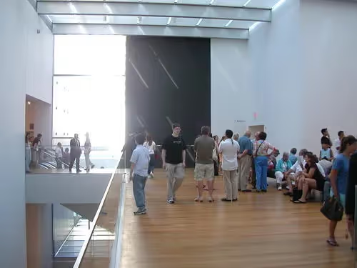
The re-design by Japanese architect Yoshio Taniguchi was completed in 2004 and nearly doubled the museum's gallery space. It also introduced a circulation system that heightens your awareness of fellow museum-goers as you move between galleries. As critic Arthur C. Danto put it in The Nation, "The consciousness of others moving from stage to stage and space to space is so much a part of the experience that one feels one is always part of a constantly changing work of art." The effect is that going to the museum feels much more like a shared experience than it did before the re-design.
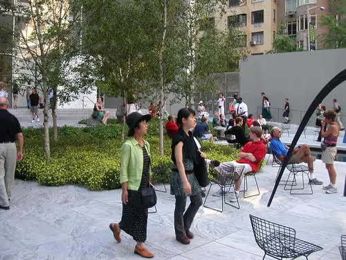
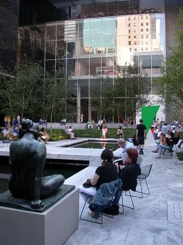
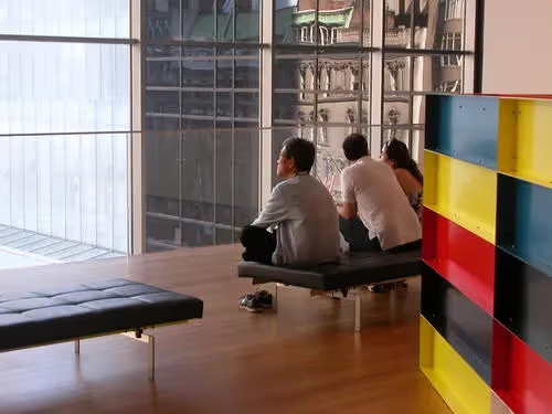
In addition to the galleries, every floor furnishes visitors with spaces to relax or have a quiet conversation, often with terrific views onto the sculpture garden below. The sculpture garden remains the social heart of the museum, full of people discussing what they've seen, enjoying something to eat from one of the museum's two caf_s, and sitting in moveable chairs among works by Rodin, Picasso, Calder, and other masters.
Here's one area where the museum does not fare so well. For starters, the entry fee has been raised to a steep $20 since the renovation was completed, a hefty sum even for Manhattan. And although the museum is easy enough to get to by transit and on foot, the approach along 53rd or 54th Streets is marred by huge blank walls--a major reason why only the interior qualifies as a great public space.
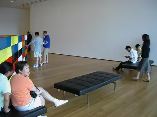
Care has clearly been taken to provide museum-goers with plenty of places to rest their feet. One small but telling detail that shows someone actually thought through the realities of spending long hours at the museum: There are seating areas near the restrooms on each floor where people can wait for their companions.
You could spend all day and then some perusing the galleries, and if you start to feel hunger pangs there are a pair of caf_s to satisfy you (and a fine dining establishment called The Modern). The traditional museum gift shop is present too, as are more open, unexpected areas where books and art memorabilia tailored to special exhibits are on sale. The sculpture garden is a terrific respite, providing a sociable outdoor space and a markedly different way of looking at art than the galleries inside.
The MoMA is a surprisingly sociable place, especially for a museum. Part of the reason is the quality of the collection, because the pieces spur a lot of discussion among visitors. The re-designed interior also fosters a sense of communal activity. Going to the MoMA does not feel like a solitary endeavor, but a pleasure that you partake of with other museum-goers.
MoMA debuted in 1929 but did not find its permanent home until ten years later. Intended from its inception to house the greatest collection of modern art in the world, the museum expanded in the 1950s and 60s, including the addition of the Abby Aldrich Rockefeller Sculpture Garden. MoMA also underwent a major renovation and expansion in 1984, but it was not until the Taniguchi re-design that the facility could properly showcase its enormous collection and provide the public with compelling spaces to view and discuss modern art.


*Please note that these Hall of Shame nominations were written in a moment in time (most over a decade ago) and likely have since changed or even been transformed. If the above entry is now great, or still not so great, go ahead and comment below on how it has evolved or nominate it as a great place.