A biweekly newsletter with public space news, resources, and opportunities.
A curated dispatch on all things public markets plus the latest announcements from the Market Cities Program.
Please note that these Hall of Shame nominations were written in a moment in time (most over a decade ago) and likely have since changed or even been transformed. If the above entry is now great, or still not so great, go ahead and comment below on how it has evolved or nominate it as a great place.

This plaza is a windswept photo-op and a barren wasteland.

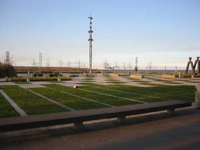
The new Plaza de Accesso (Access Plaza) is a hole, a windswept photo-op for an architect and an imposing and barren wasteland for anyone looking to do anything human. Located between the Rio de la Plata and the Jorge Newberry Airport, it is both the terminus of a 3 km long riverwalk and the entrance into one of the main campuses of the University of Buenos Aires. This context presents challenges to creating a place useful to people, but also incredible opportunities for unique urban experience. It fails.
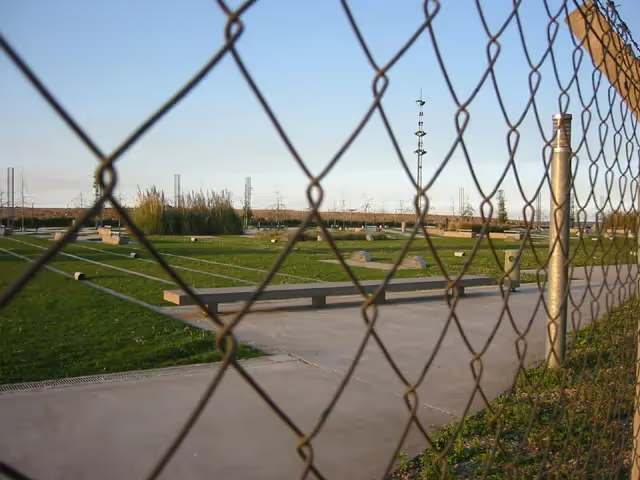
The design seems to be an exercise in hilarity. Surely some silly architect decided to see what expensive and asinine design they could convince someone to build. Starting with the 2 m high chain-link fence topped in barbed wire that surrounds the plaza, every movement, every interaction, every element is absolutely controlled. You are only allowed in through the gates which were locked during hours they were supposed to be open. The paths and spaces donÍt lead anywhere. The benches are monolithic and self-important. Instead of places for humans to sit, they are rejects from an industrial concrete plant. They face nothing interesting and obviously cannot be moved or improvised with. They were made for skateboards and nothing else. The plants are simplistic and contained, a good metaphor for the whole park.
The Plaza de Accesso is only the first part of the huge engineering and design project that is to be the Parque de la Memoria. Perhaps the rest of the park will take advantage of the exciting and difficult location and be able to draw people from all over the city to experience the river, the fishermanÍs walk, and the planes flying in and out of the city. However, if the entrance plaza is any indication, it will be a forgotten space in the city, important only in its own mind. And perhaps a few design magazines.
The Plaza de Accesso easy to reach on foot or by car since it is a part of the river promenade. Also, many buses serve the area as it is adjacent to the airport and university campus. Once at the plaza however, access is a different story. A high chain-link fence topped with barbed wire surrounds the plaza. The pathways within the plaza are easy to walk along but lead to nothing. Instead, they are a geometric exercise that looks mildly interesting but function poorly as pathways for people. The view out across the river could be wonderful, but there are no areas or special pathways leading to areas to view the Rio de la Plata. Instead, they give the same experience of looking across the river from the road.
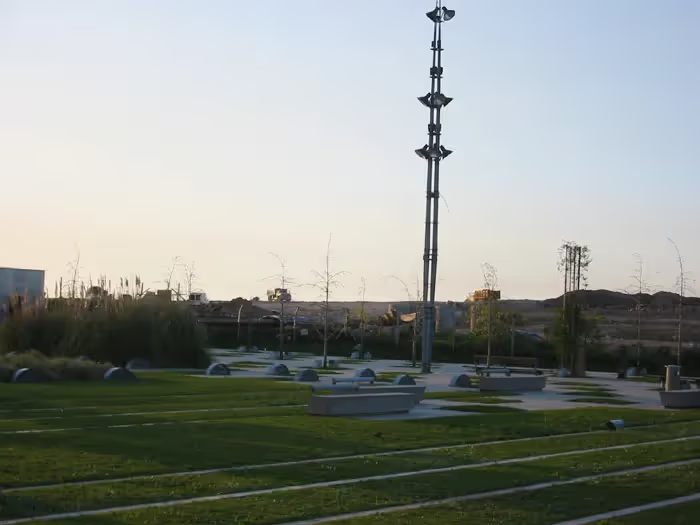
The Plaza is horribly uninviting and there is almost no one there. On my trips there, I have been the only person there. Every once in a while, a straggling person wandered through and attempted to find a good place to read or sit with a group of friends. They could not. There are current construction projects happening on two sides of the project and these serve to scare away people. The opportunity to view a building project curiously while enjoying the plaza has been missed and the bulldozers and mounds of dirt instead serve as a sign telling people to stay away, that this is not a place for people (yet). While it may be unfair to judge a plaza while current projects are going on right beside it because of the heavy machinery and lack of plants, this attitude is actually a microcosm of what is wrong with the project in general. The chance to observe how the land is being shaped and engineering structures are being built along the edge of the river- a potentially interesting process- instead is nothing more than an uninviting nuisance (the same as the airport).
There are no uses or activities to speak of. No variety in spaces is created by the paths, benches, and plants. The sculptures seem to be the intended place of activity and interest because of their great size and the fact that they are recognizable as "art". However, they invite little human interaction and few interesting experiences and as such are lonely, self-important, ill-placed oddities in the plaza.
The only people using the plaza seem to be lost stragglers. People all along the river promenade are fishing, taking photos, walking, and enjoying views over the river and back towards the city. The plaza is the place to turn around and nothing more. It is unfortunate that there are no places to study for the huge number of students so close by, no place for viewing the planes coming in, no nice experiences of the river. Without these experiences, the plaza attracts almost no one.


*Please note that these Hall of Shame nominations were written in a moment in time (most over a decade ago) and likely have since changed or even been transformed. If the above entry is now great, or still not so great, go ahead and comment below on how it has evolved or nominate it as a great place.