A biweekly newsletter with public space news, resources, and opportunities.
A curated dispatch on all things public markets plus the latest announcements from the Market Cities Program.
Please note that these Hall of Shame nominations were written in a moment in time (most over a decade ago) and likely have since changed or even been transformed. If the above entry is now great, or still not so great, go ahead and comment below on how it has evolved or nominate it as a great place.

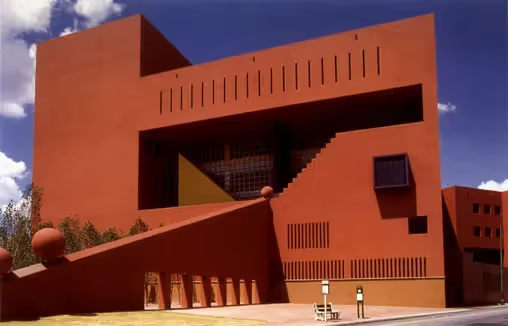
Built by an award-winning architect, this place exemplifies the type of object-focused architecture that is unconnected to anything around it.

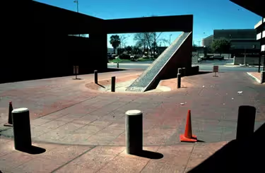
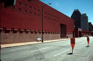
Why, of all buildings, should a library be totally isolated from the rest of the community? San Antonio's Library, designed by award-winning architect Ricardo Legorreta Vilchis, excels at setting itself apart from the city - even though it's in the heart of downtown. Its lack of access creates a denigrating human environment for anyone arriving by bus (bus stops are located along a huge blank wall, far from the entrance) or by car (in which case one is simply swallowed up by a garage).
With an aesthetic that might be dubbed "dressed-up Home Depot," this building has no sense as a place in which one can do anything more than drive by blank walls. It's very arrogant in this regard, holding itself apart as a prima donna place whose immediate surroundings are frosty, barren, and downright boring. This lack of connection to other uses or activities downtown is truly a shame, because the inside of this building is apparently very popular with citizens and visitors alike. What a lost opportunity: Think of what downtown San Antonio could be like if those thousands of daily library users had great places to go when they left the building - instead of being funneled back into the parking garage or dismissed at a bad bus stop.
The 240,000 square-foot building was designed by Legorreta Arquitectos of Mexico City; it opened in 1995.


*Please note that these Hall of Shame nominations were written in a moment in time (most over a decade ago) and likely have since changed or even been transformed. If the above entry is now great, or still not so great, go ahead and comment below on how it has evolved or nominate it as a great place.