A biweekly newsletter with public space news, resources, and opportunities.
A curated dispatch on all things public markets plus the latest announcements from the Market Cities Program.
Please note that these Hall of Shame nominations were written in a moment in time (most over a decade ago) and likely have since changed or even been transformed. If the above entry is now great, or still not so great, go ahead and comment below on how it has evolved or nominate it as a great place.

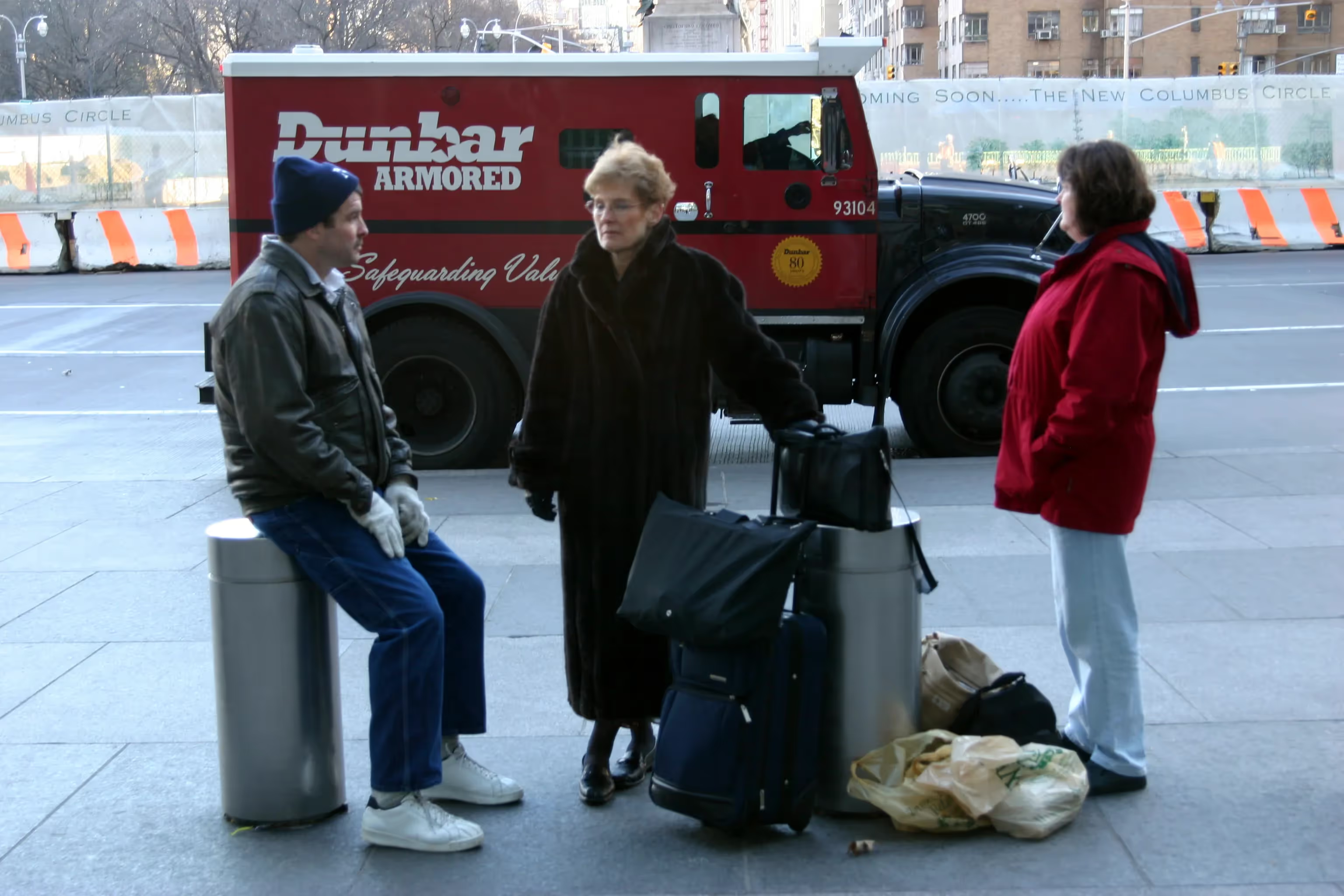
Columbus Circle is a transitory place that people pass through, while it could be a true destination.

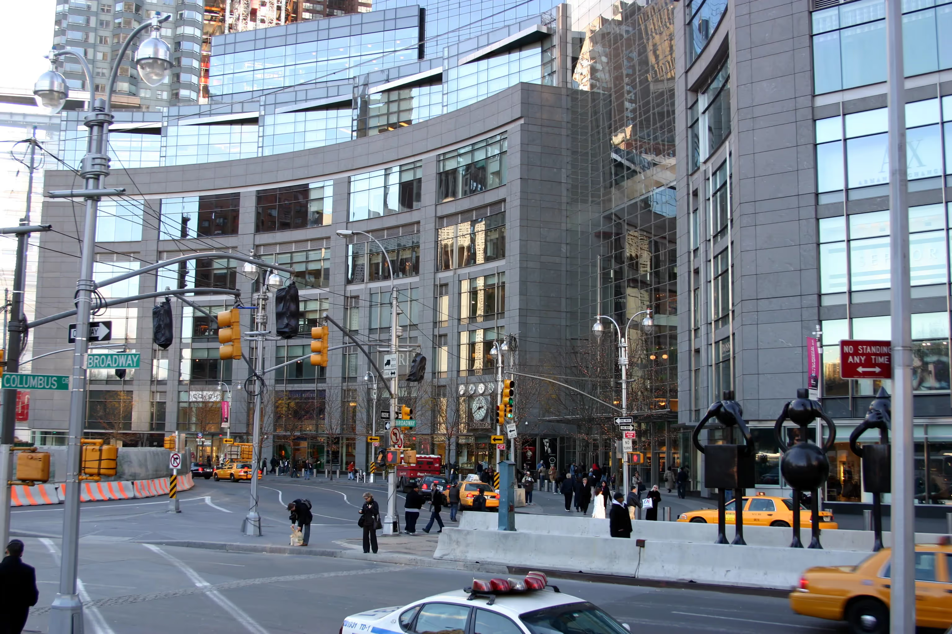
Perhaps because the Time Warner Center replaced the stultifying New York Coliseum, its initial reception was much more positive than deserved. Take a second glance, and this complex is revealed as the anti-urban edifice it has always been. The problem is that the building does not engage the street. It is essentially a shopping mall inside, with little or no hint from the outside that anything is going on. Circulation occurs within the confines of the privately owned indoor space, not on public city streets. Because the design is so insular, stores are putting advertising in the windows, and the building is starting to look like a billboard. Compared to Fifth Avenue in Midtown, where the storefronts are creative and the sidewalks alive with activity, the Time Warner Center is a dumbed down excuse for a commercial district.
The rest of Columbus Circle is no better. The other buildings are blank and lifeless. The traffic circle, though recently improved with a new fountain and more pedestrian space, still gives auto traffic at least forty percent more space than warranted. Overall, Columbus Circle is still a transitory place that people pass through, not a true destination.


*Please note that these Hall of Shame nominations were written in a moment in time (most over a decade ago) and likely have since changed or even been transformed. If the above entry is now great, or still not so great, go ahead and comment below on how it has evolved or nominate it as a great place.